Pawtech
Brand Design
May 2024
Project Details
Time Spent
62 hours
Tasks
Brand Design
Illustrator
Textile Design
Design System
Copywriting
Tools Used
Adobe Illustrator
Adobe InDesign
Project Type
Brand Ecosystem
The Ask
Create a visual and verbal identity for an original product and use it to develop key physical components that coexist in a brand ecosystem.
Concept
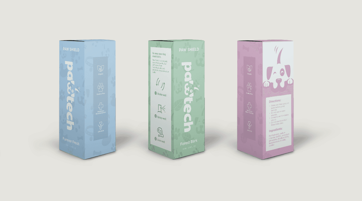
Pawtect’s Pawshield is a spray-on protectant that guards your pets paws against any salts and pesticides that may be encountered on walks. As opposed to making your furry friend wear paws, Pawshield is a light-weight undetectable alternative to keep your furry friends safe. Additionally, Pawshield comes in a variety of fun and yummy scents!
This brand is marketed towards pet owners. While Pawtech primarily targets dog owners, future products may be appropriate for other furry friends as well. The brand is fun and loyal while still being trustworthy and effective.
Logo
Pawtech has a fun and loyal tone alongside qualities of trustworthiness and effectiveness. It was challenging to incorporate these two qualities being that they are typically represented by contrasting design elements. Round and unstructured designs and genuinely considered to be fun and playful, while structured and minimalist designs resemble trustworthiness and healthcare.
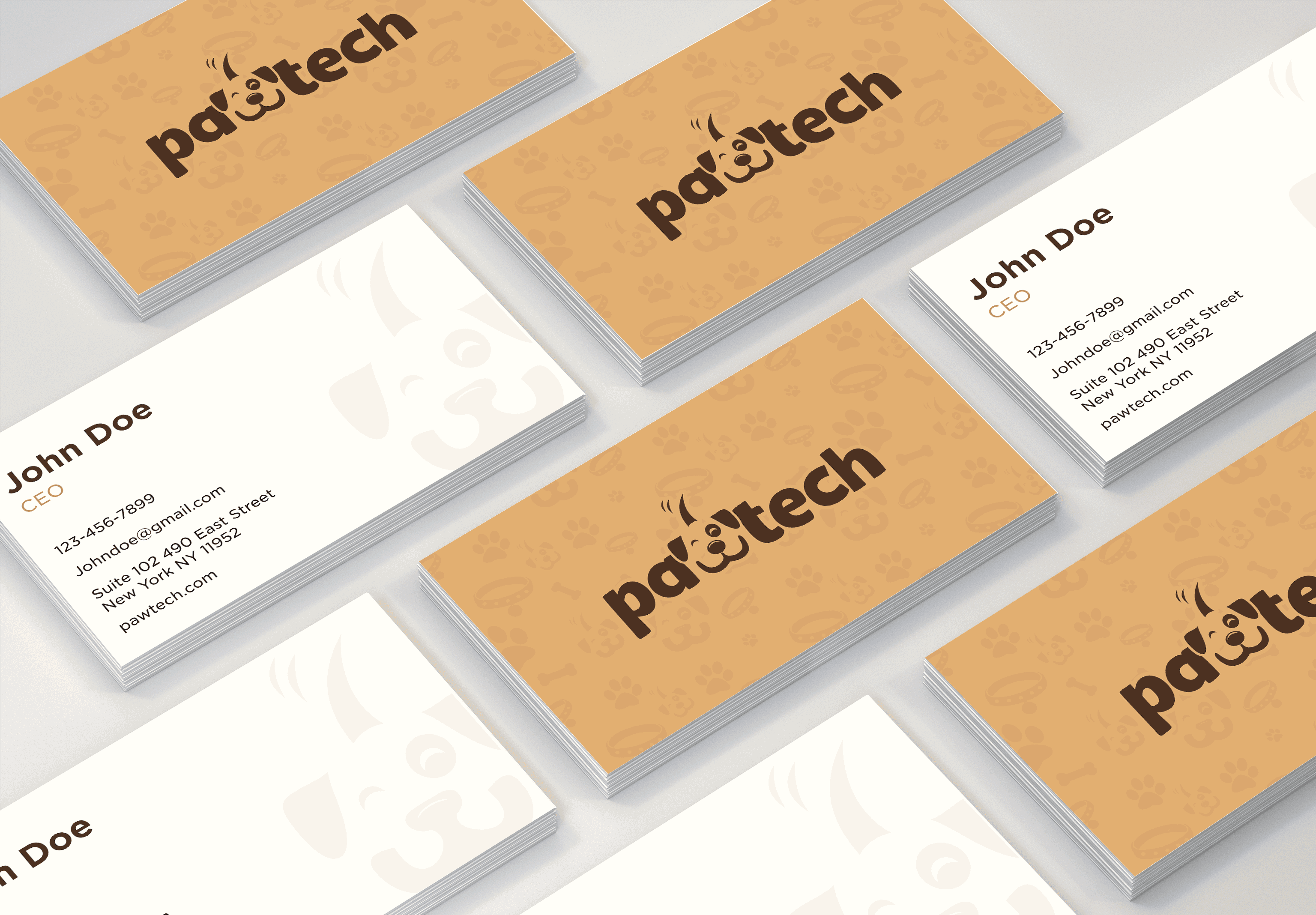
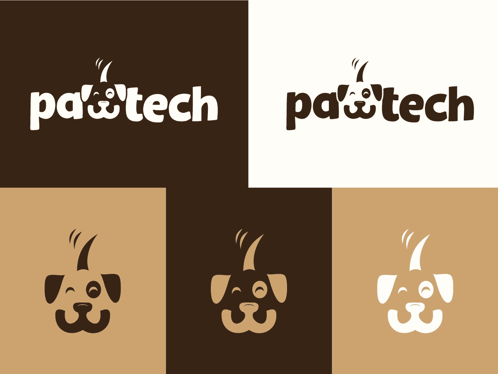
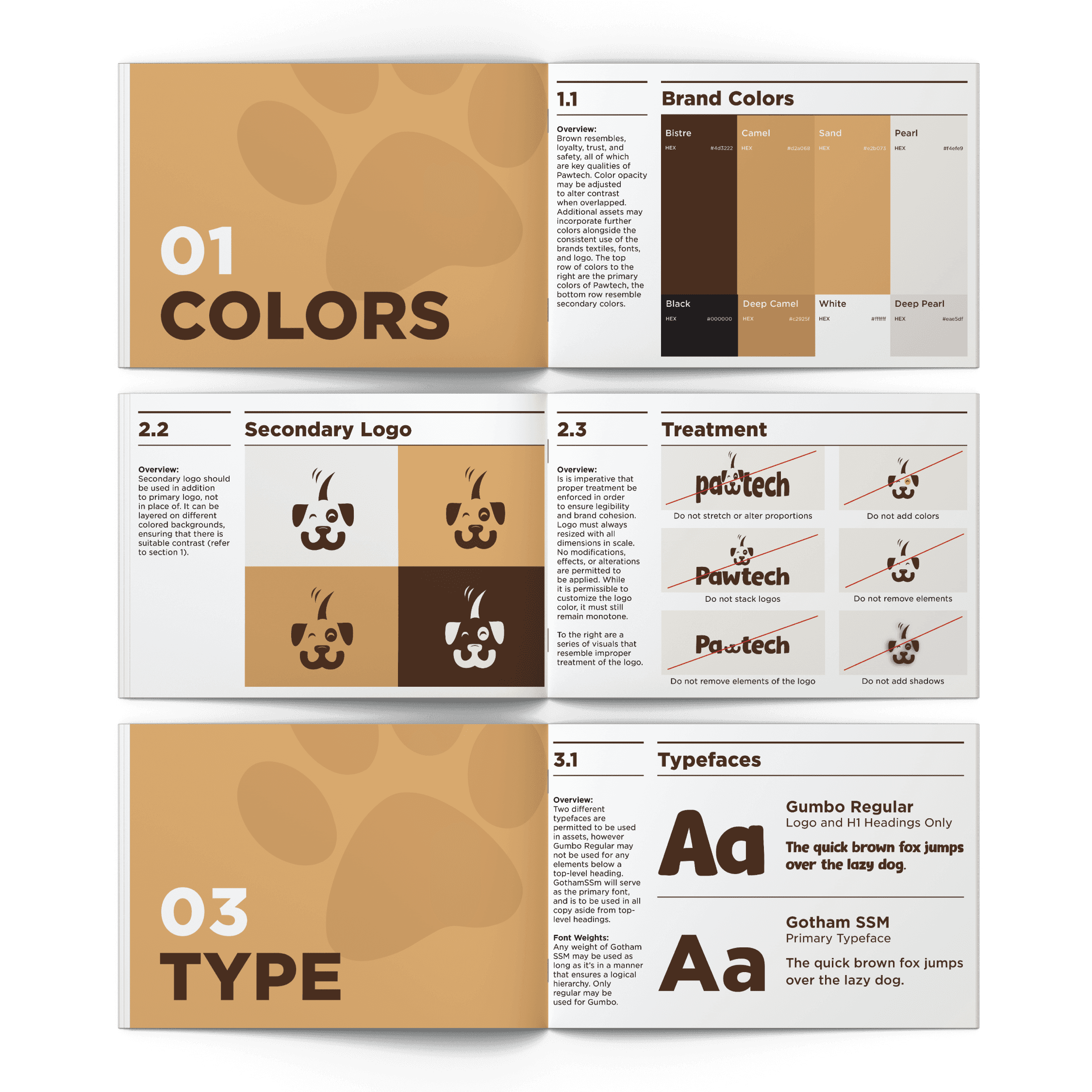
In order to communicate that Pawtech is fun and loyal while still being trustworthy and effective, it was important to design a logo that is playful, distinct, and simplistic. By transforming the “w” into the mouth and nose of a dog, and adding in the eyes, ears, and tails to complete the icon, the logo visually communicates what the brand is. I chose to use a bold and playful font so the logo is legible, eye-catching, and communicative of the brand identity.
Color
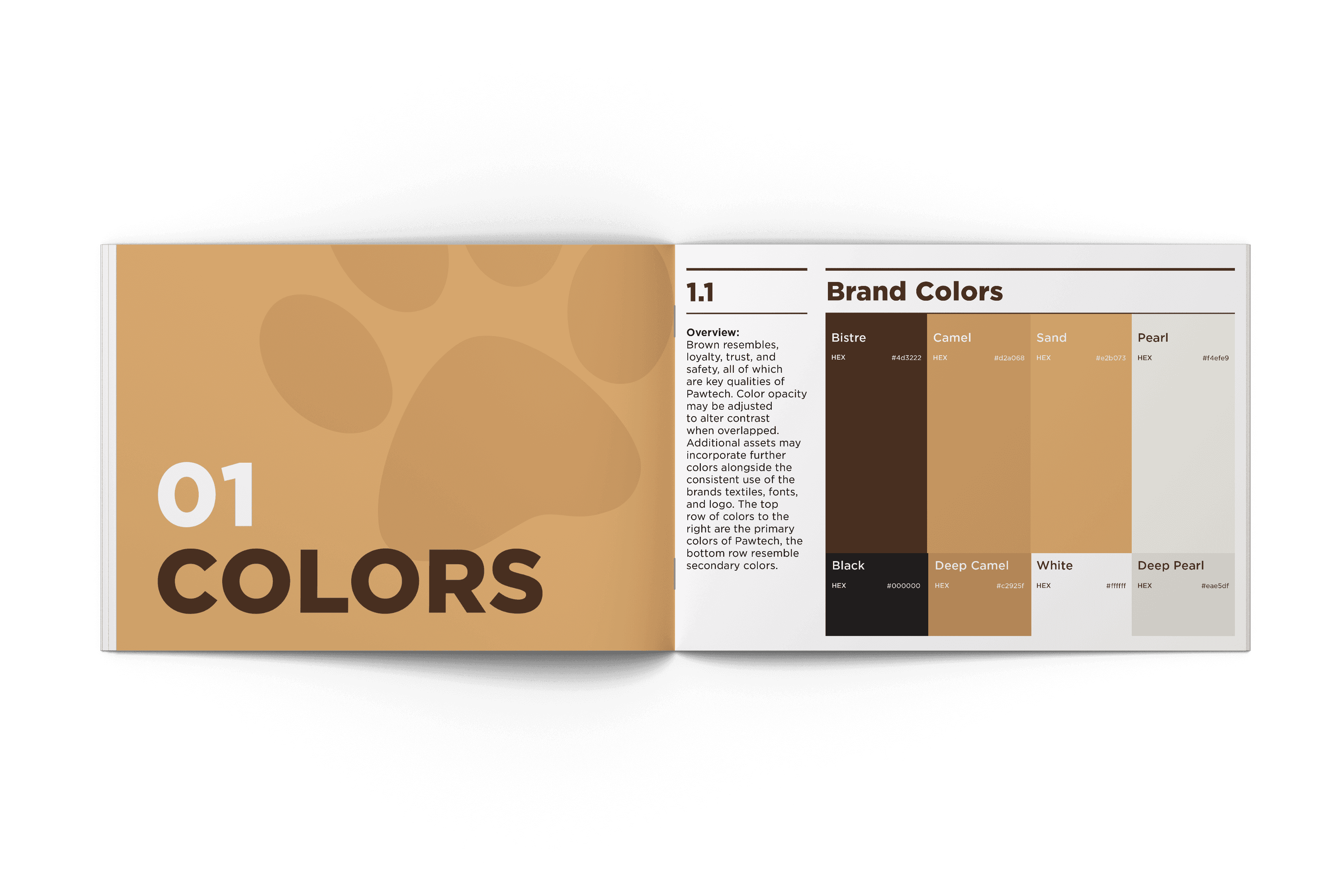
I settled on using shades of brown among the brand ecosystem because this color represents loyalty, trustworthiness, and is often associated with pets and animals. I ensured that all shades had enough contrast to be layered on top of one another, while also choosing two shades with lower contrast to be used in layering patterns on-top of backgrounds in a way that did not take up too much visual weight. Being able to layer colors on-top of one another allowed me to form a more playful voice with colors that aren’t generally considered to be fun and exciting.
Takeaways
I learned a lot about the communicative power of different types of fonts, colors, and layouts. This project specifically emphasized the importance of carefully considering all of the small aspects, as they add up to communicate a bigger message. Having been so careful and intentional throughout this assignment, I noticed that being a strategic designer is what truly takes my work from being aesthetic to being communicative.
