MySlice
UX/UI Design, UX Research
December 2023
Project Details
Tools Used
Figma
Adobe Illustrator
Powerpoint
Problem
The Challenge
How can we identify and address pain points when it comes to using MySlice to enroll in courses?
Background
MySlice is the portal students at Syracuse University use for accessing anything from their grades, financials, transcripts, and class schedules. Throughout the semester, my group focused on the scheduling portal within MySlice to find pain points that we could improve.
My Role
Having a strong foundational background in UX/UI design, I obtained more of a leadership role throughout the duration of this assignment. Much of the research conducted was in collaboration with the other members of my group, however, I created all prototypes included in this case study on my own.
Research
Research Methodologies
As a group, we conducted user interviews, held user observation sessions, created a competitive analysis, facilitated a focus group, and used maps and diagrams to identify all stakeholders, potential pain points, and opportunities which were later used to make research-driven design decisions.
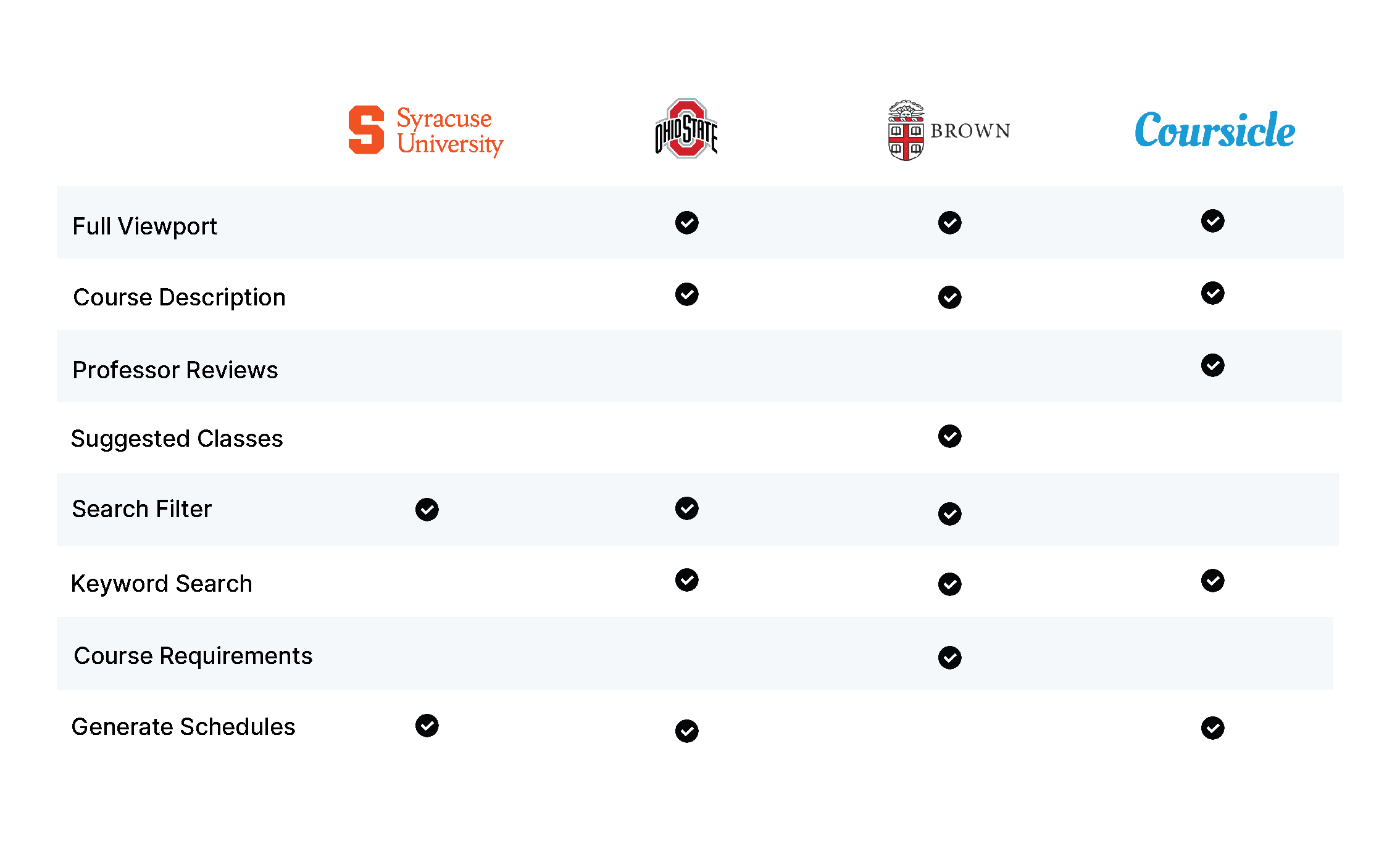
Competitive Analysis
Exploring what other schools do gave us a perspective on the scope of the problem - is this something that should be tailored for Syracuse University, or for other schools too? Furthermore, seeing what features other schools provided that Syracuse does not serve as inspiration for components and layouts that MySlice can incorporate to become more efficient and user-friendly.
User Interviews & Observation
Each group member was responsible for conducting a one-on-one interview with a user of MySlice. Doing so allowed us to gather further insights on pain points that we could address. We all chose a Syracuse University student as an interviewee as they are the primary users. We observed two students navigate MySlice to create a schedule for the upcoming semester. Doing so helped us better understand the user journey. We were also able to observe which functionalities students heavily relied on, and what resources students utilized to create a schedule.

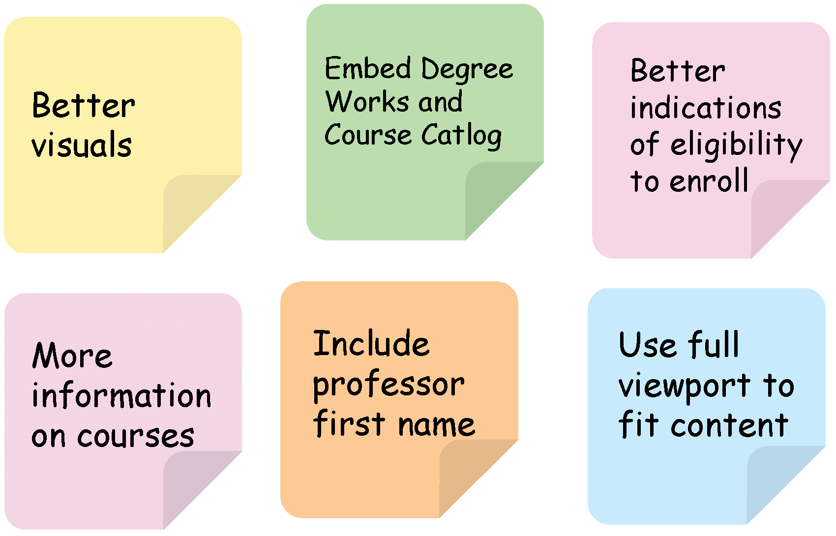
Focus Groups & Brainstorming
We hosted two brainstorming sessions - one with just our team and another with a group of users - to ideate over opportunities and potential solutions. Below are some ideas generated from the sessions.
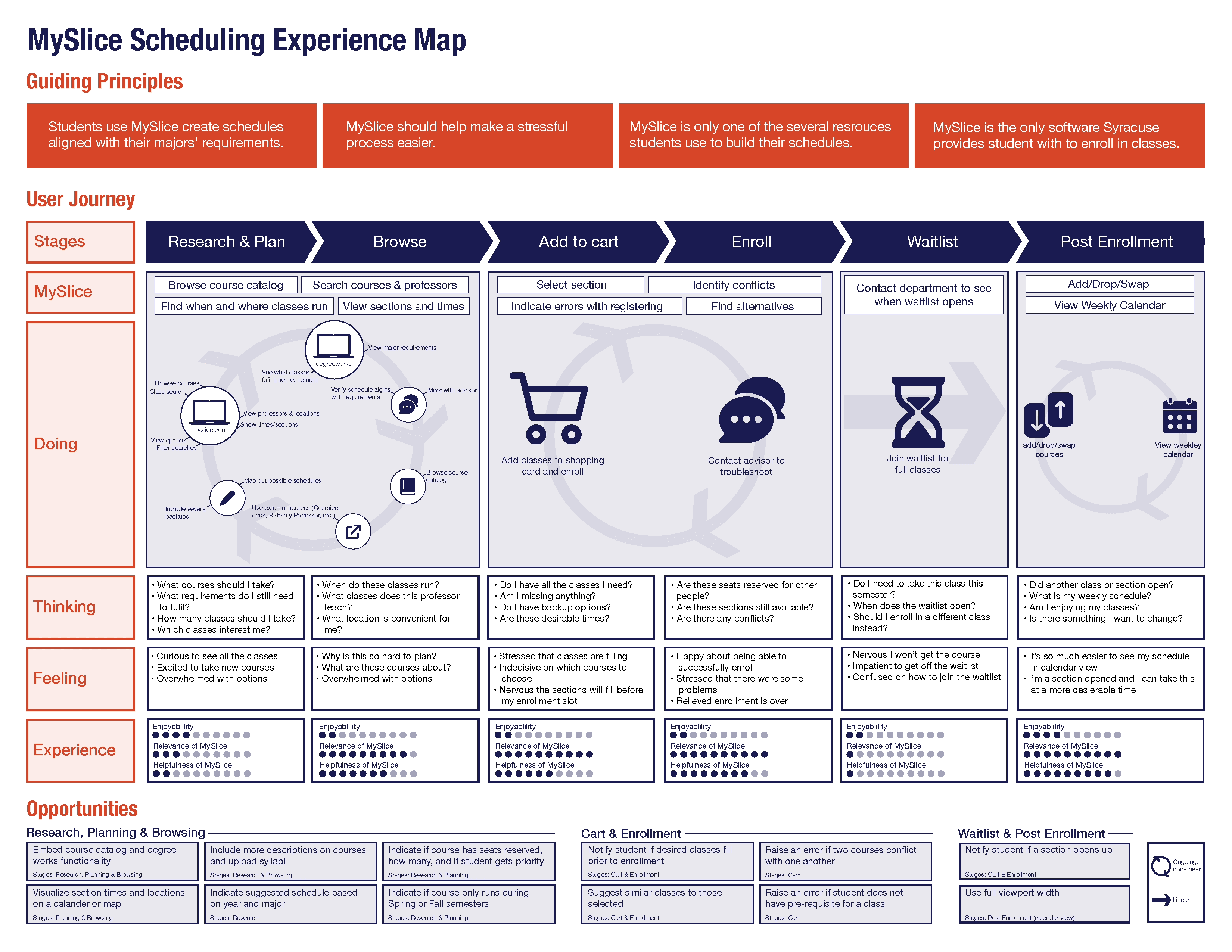
Maps & Diagrams
My group and I used these insights to map out the user journey and make a cognitive diagram in order to better understand pain points and which areas we should focus.
Wireframes
High Fidelity Mockup
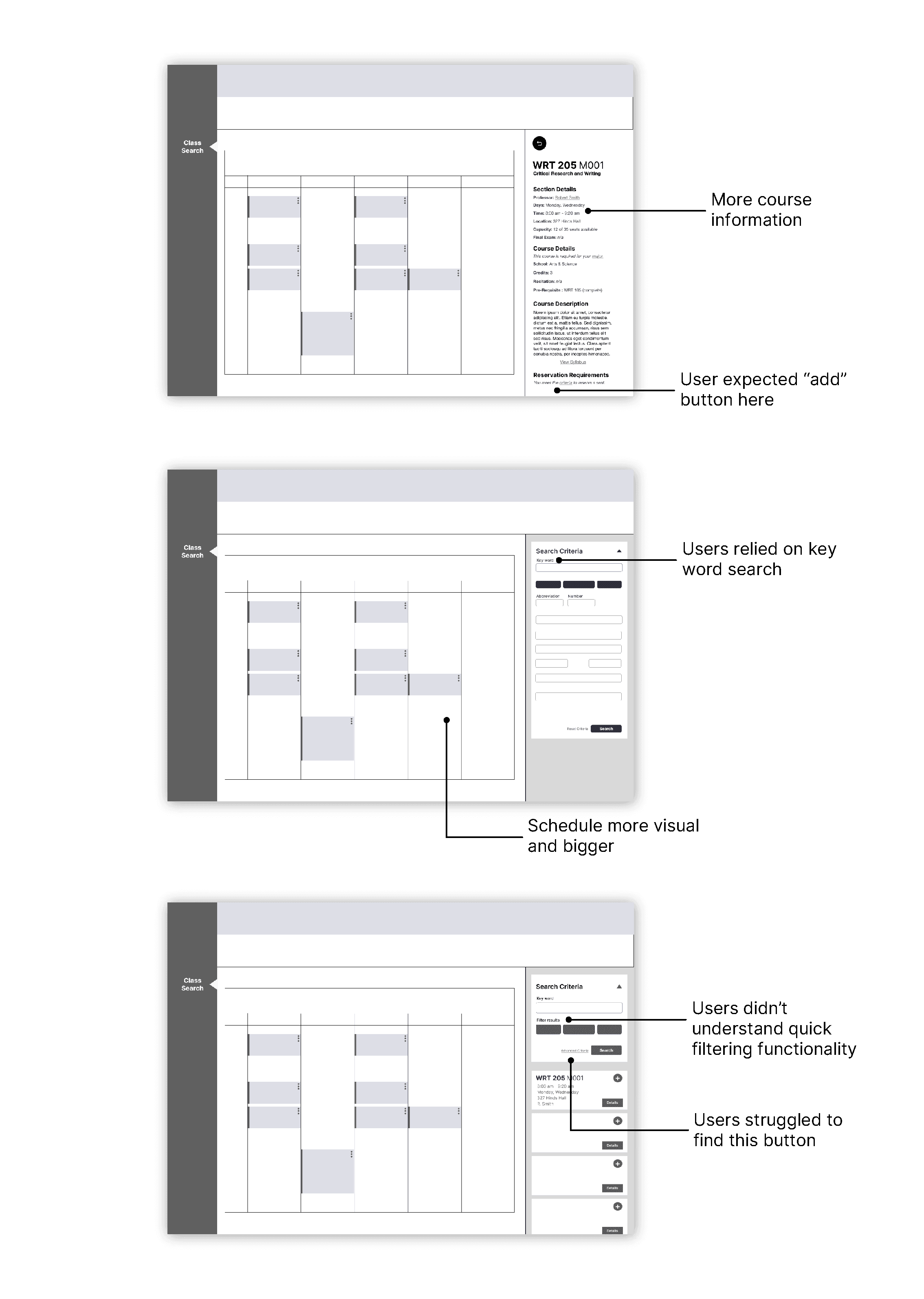
Low-fidelity wireframes were initially printed and used as paper prototypes.
I created a low-fidelity mockup of a potential design solution to print and use in think-aloud exercises. Being that this was a paper prototype (though designed digitally), its purpose was to not only iterate over layout designs, but also potential features involved in crafting the user experience.
Design System
Styleguide
All colors used were based on the branding of Syracuse University branding. Creating and maintaining a cohesive style guide helped organize the information structure of the content.

Mockups
High Fidelity Mockup
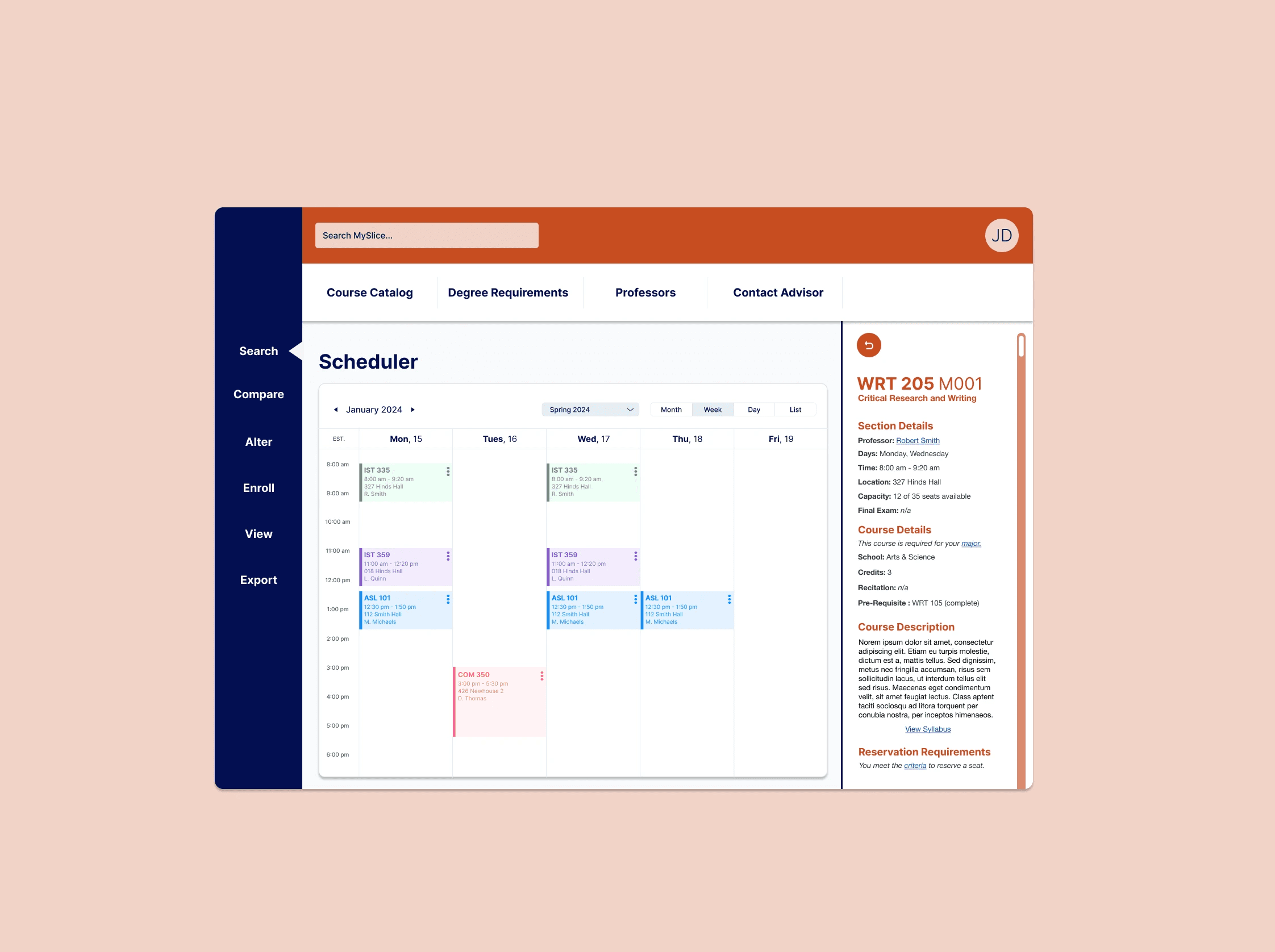
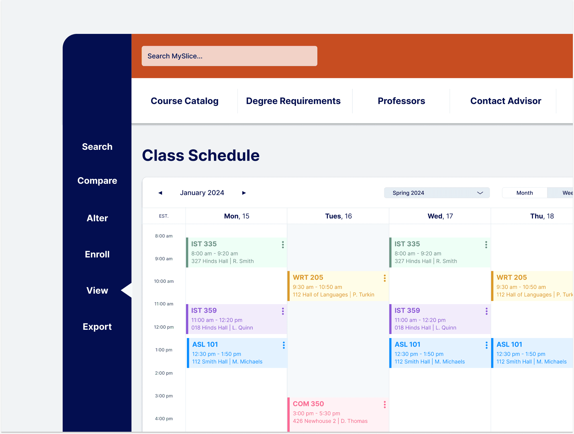
I created high-fidelity prototypes in Figma that incorporated the desired design solutions and features we indicated through our research and iterations.
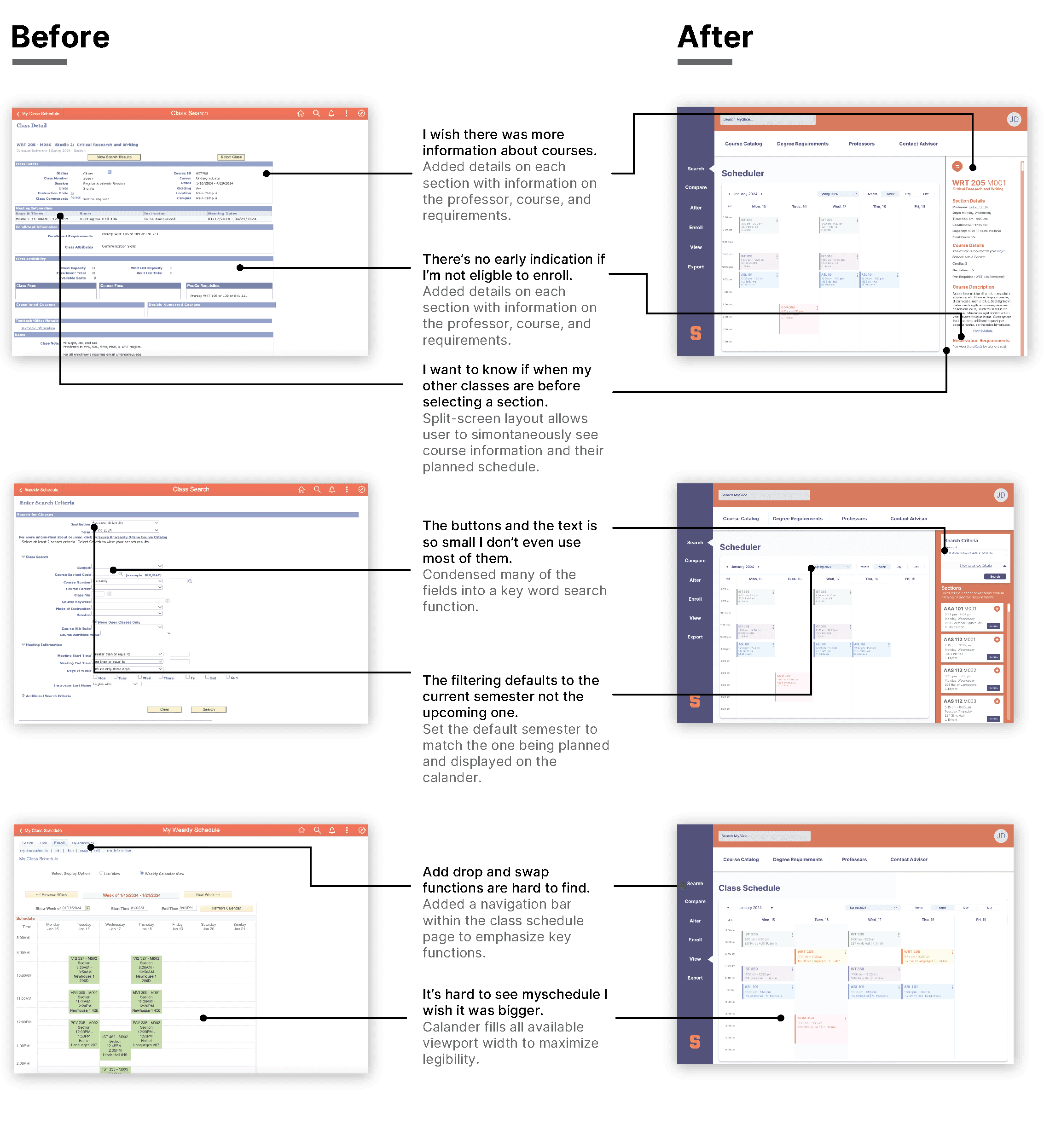
Design Solutions
All design decisions were made based on research. As demonstrated in the mockups, my final design solution incorporated more visuals, information, and user interactions. I ensured to utilize the full viewport, and visually emphasize frequently used functionalities.
Adding a Course and Viewing Details
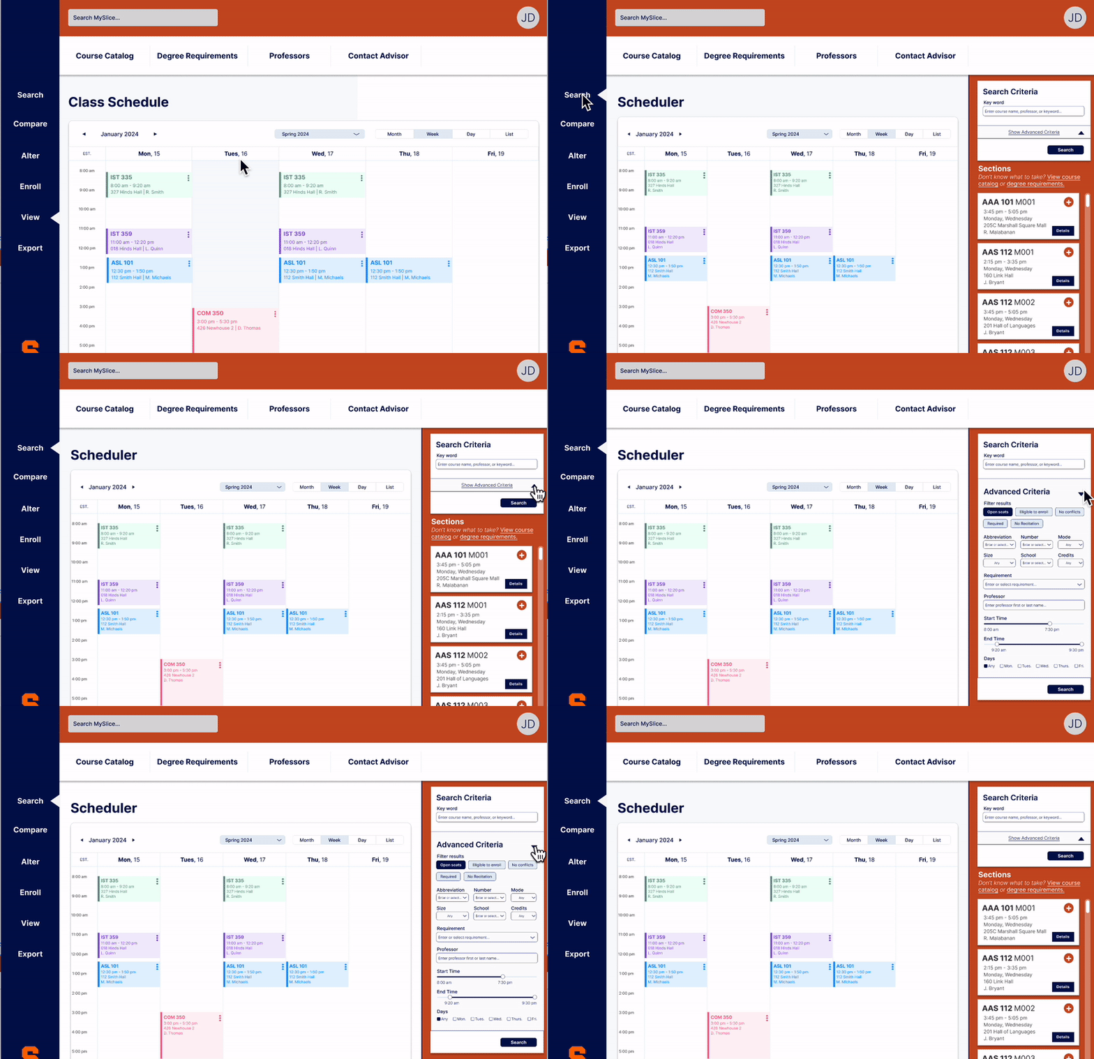
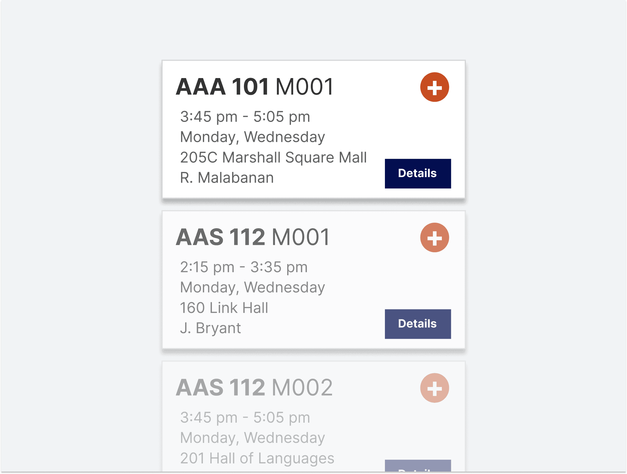
Interviewing users revealed that they were frustrated by the lack of inclusion of sufficient information about courses, sections, and professors. By redesigning the layout to be more visual, interactive, and detailed, the user can access more functionality without leaving the current page they are on.

Simplified Filtering
Rather than having the user search by the course abbreviation and number, I incorporated a keyword search functionality that will return results based on any information the user chooses to input. There is an advanced search criteria window the user can expand if they desire to filter their results based on more specific attributes.
