UI Timeline
UX/UI Design, UX Research
October 2024
Project Details
Tools Used
Figma
Illustrator
Problem
The Challenge
How might we present the history of UI design in a way that engages and excites an uneducated designer?
Background
The history of UI design is a critical base from which we can extend ourselves to understand better how we got here and where we choose to go next! However, history can be boring, and technology can be uninteresting. Combine them, and it can be a snoozefest. My job as a designer is to make sure that does not happen.
Brief
For my UX/UI design class, I was given the article An Abridged History of UI and then tasked to transform the history of UI into an interactive webpage geared towards an uneducated designer.
Research
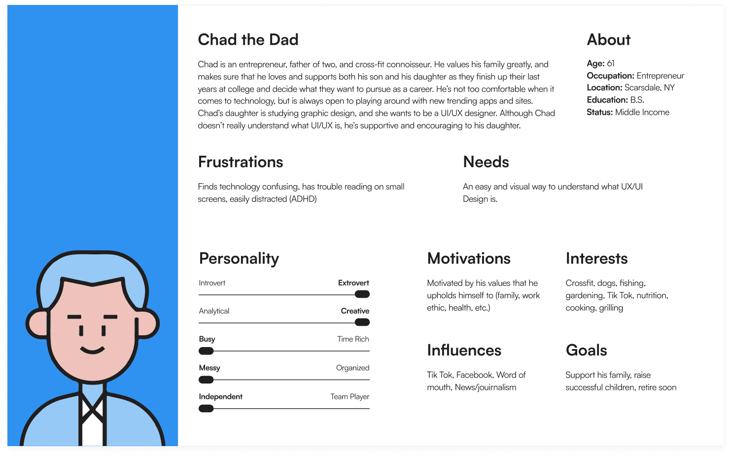
Creating a User Persona
Having an audience of uneducated designers, I narrowed my scope by honing in on the primary persona which I was able to choose at my discretion.

Iterating Solutions
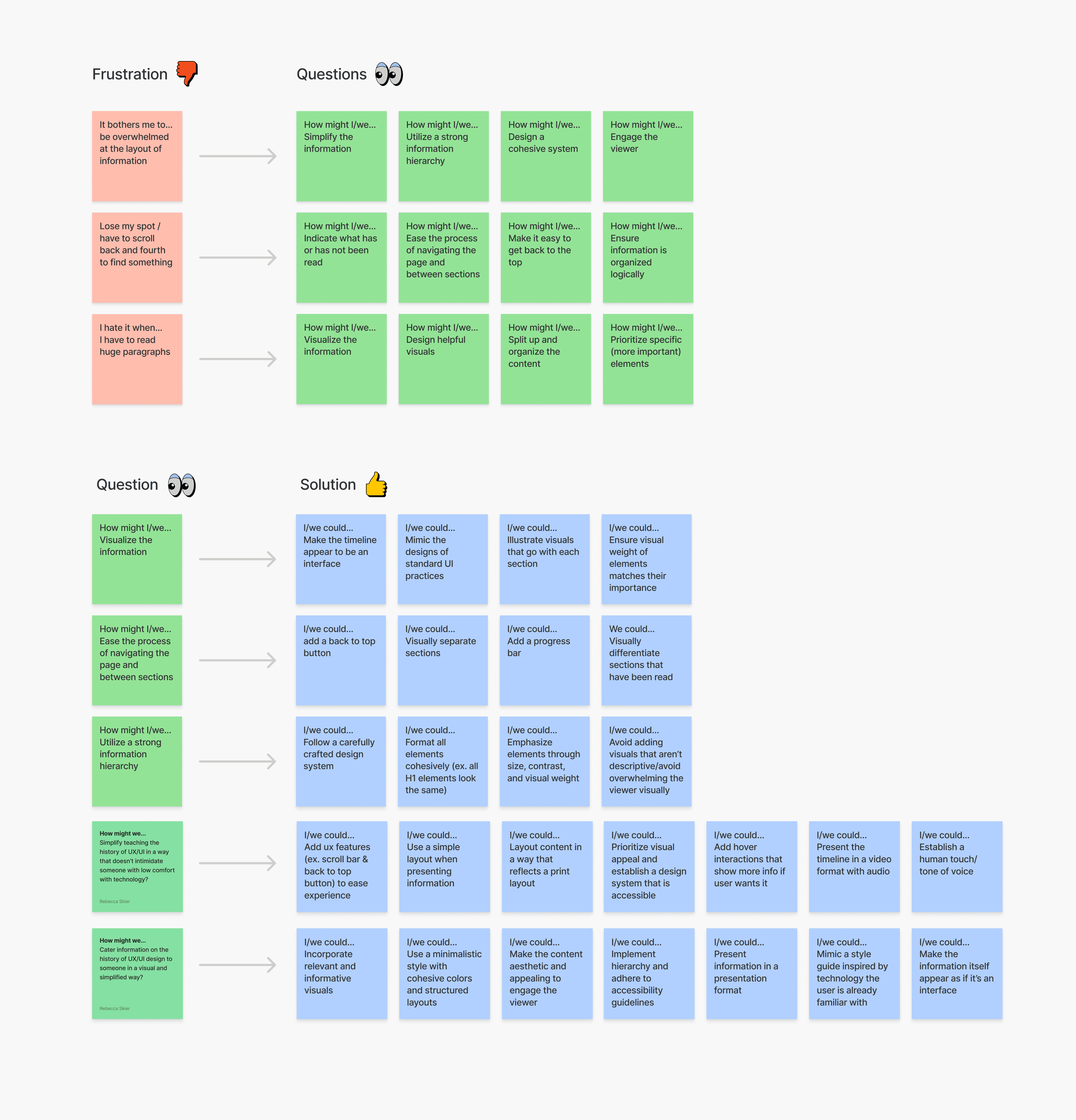
To better understand my target user, I identified some points of view and how might we statements to help drive my early-stage iterations of potential design solutions. I then used these to consider the frustrations my user might experience, question how I may go about addressing these pain points, and ideate over potential solutions.

Key Insights & Takeaways
After brainstorming, I identified key aspects I needed to address within my designs.
History is boring, and so is reading. Avoid overwhelming the user with an abundance of words, and maintain proper hierarchy.
Technology should be helpful, not hurtful. Make sure all interactions are simple and straightforward.
Visualize the information, words aren't the only way to inform.
Design System
Styleguide
When designing the user interface, I created an intentional styleguide tailored to the user's wants and needs. I chose all fonts and colors with the intention of maintaining simplicity, minimalism, and cohesivity across my page.

Iconography
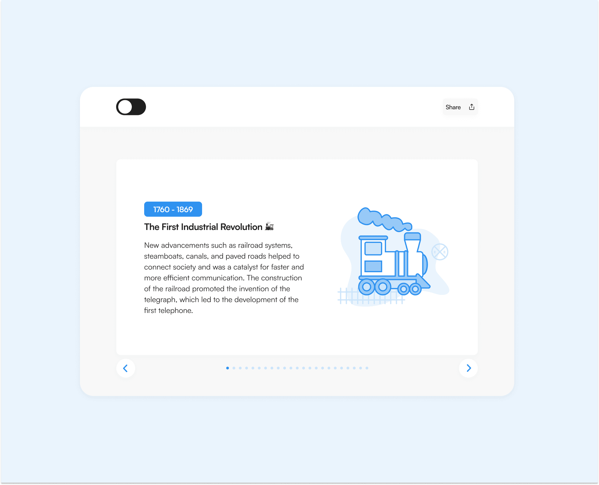
I created an illustration for each section in Adobe Illustrator. I put an immense amount of time into ensuring that my icons not only aligned with my styleguide, but were engaging and informative. To maintain consistency, I used a the same colors and stroke with for each illustration.

Mockups
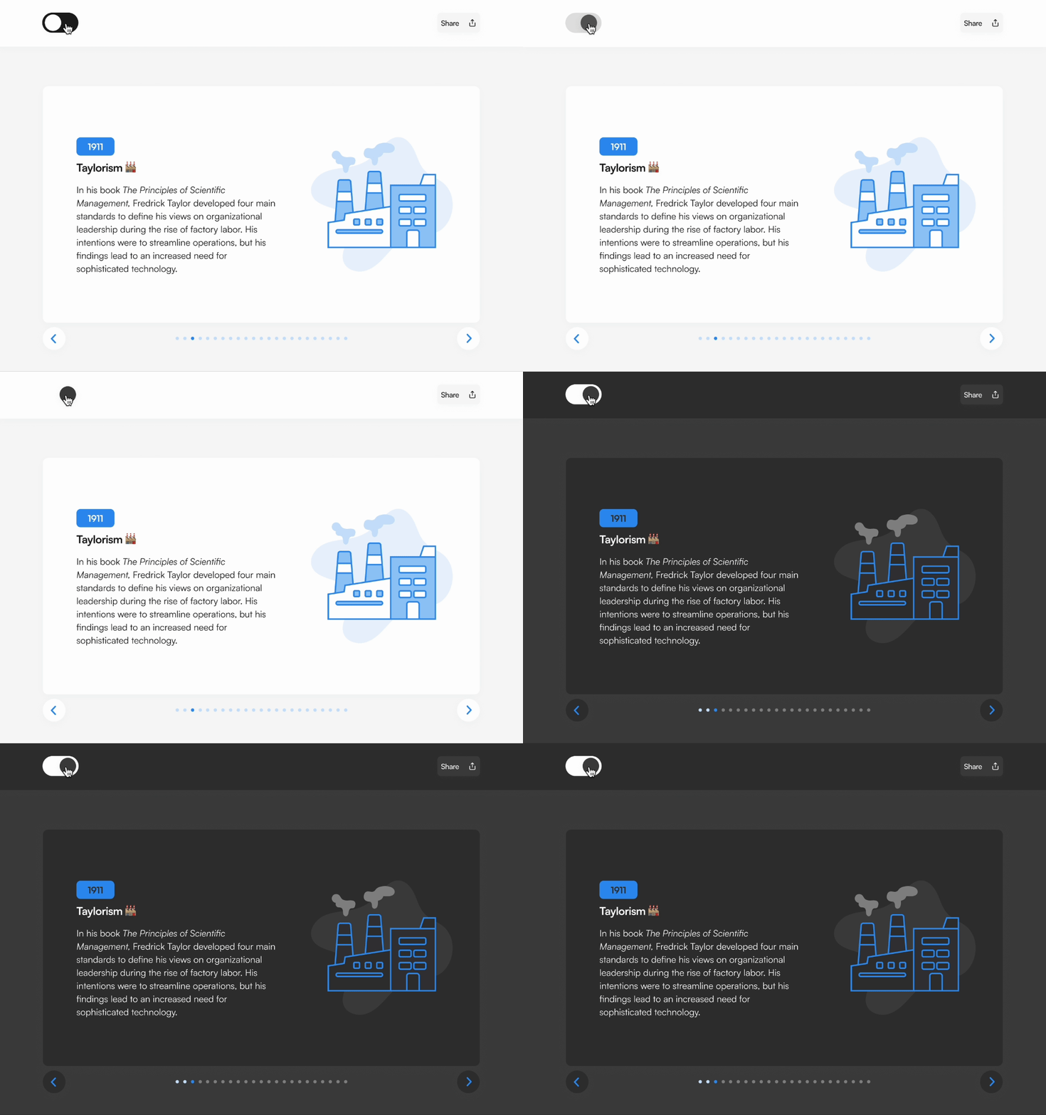
When prototyping, I incorporate simple animations to give my design some spunk and excitement without overwhelming the user. Because my target user is intimidated by technology, I ensured that all interactions were straightforward.


